The challenge
Range that read as a wall instead of a door
Breadth is the firm’s biggest asset and, on the old site, its biggest liability.
Territory works across Strategy, Innovation, Transformation, and Story. A client arriving with one specific problem could not see themselves anywhere in that, or trace a route from what they were facing to who could help.
The job was to make four different practices behave like one system, and to give every visitor an obvious next step no matter which page they landed on first.
The system
Overlapping, not siloed
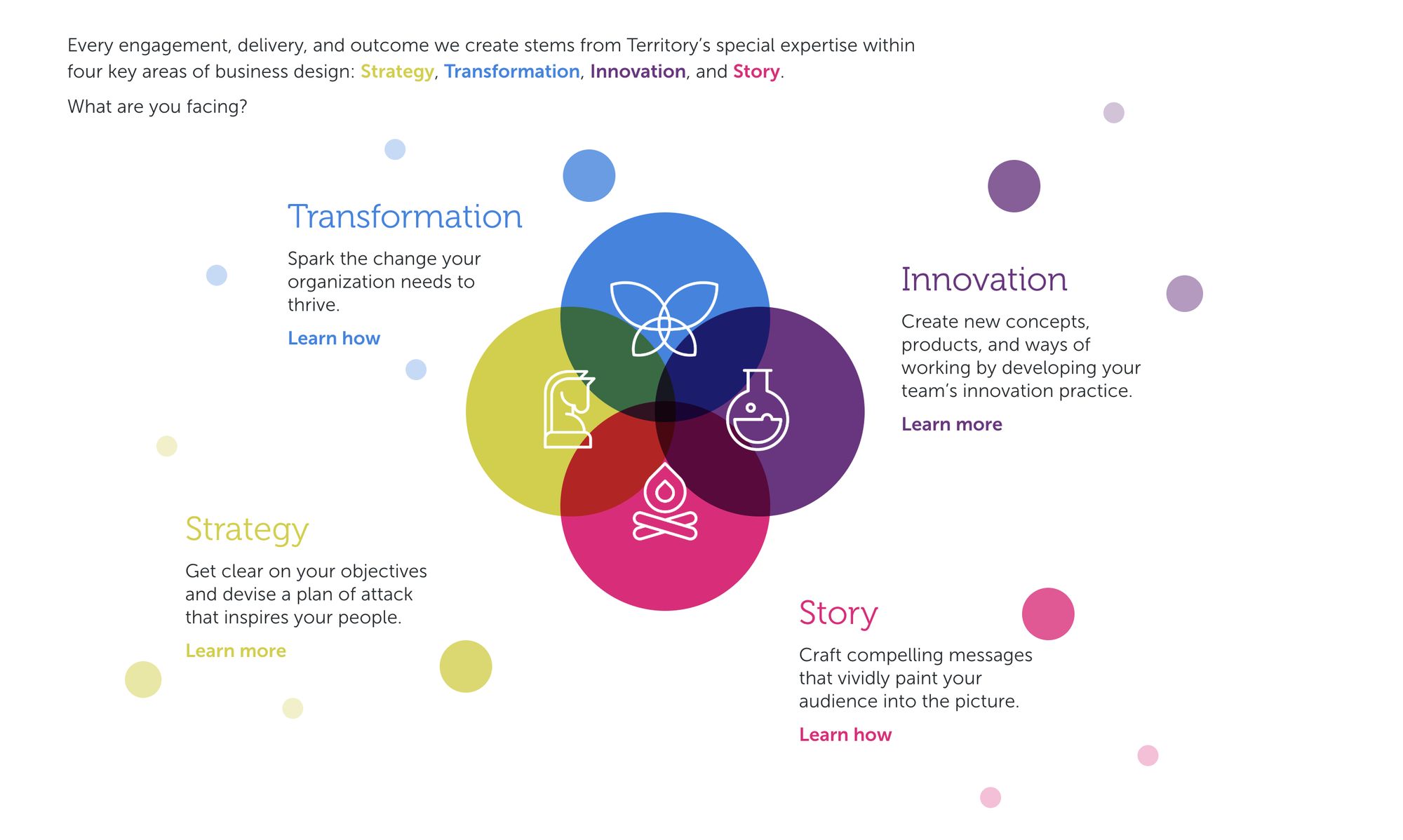
The organising idea. Wherever you enter, you can see the other three.
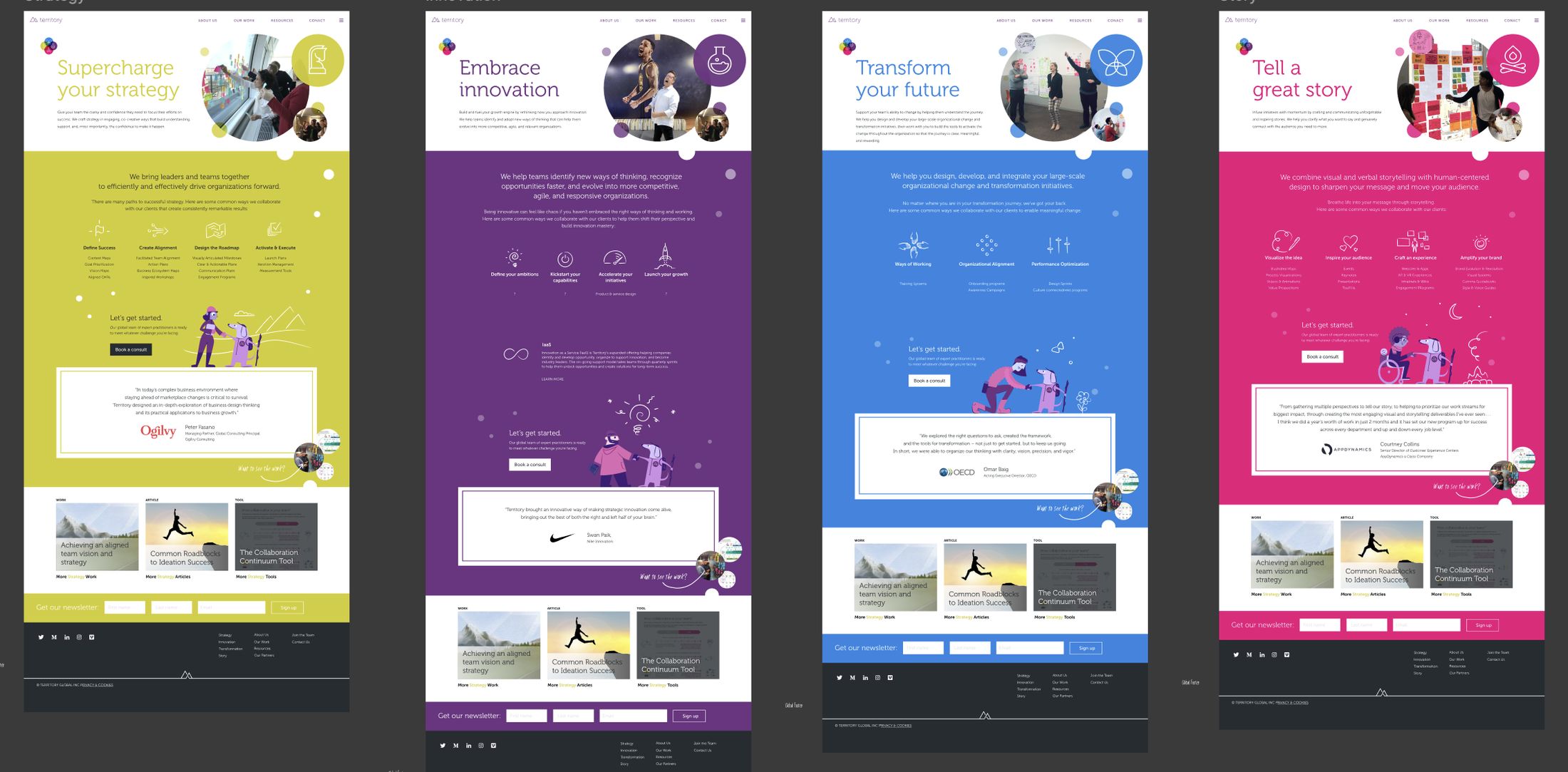
One template, four identities
Process
Alignment first, pixels second
Align internally
Ran collaborative sessions and stakeholder interviews to map how the four practices connect to the problems clients actually arrive with.
Iterate in Figma
Multiple rounds across the home page, all four offering pages, and the case study template.
Ship it live
Led implementation and brought the approved design through to the live site.
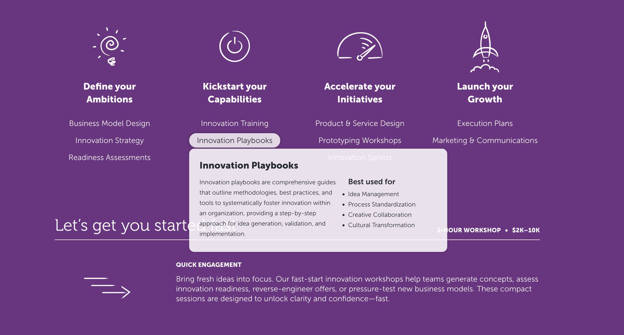
Capabilities, one hover away
Each practice owns a colour that runs through its hero art, icon set, and calls to action, and the orb navigation carries that system onto every page.
Hovering any capability opens a full card: what it is, what it suits, and what working together on it looks like. It answers the question without making anyone leave the page.
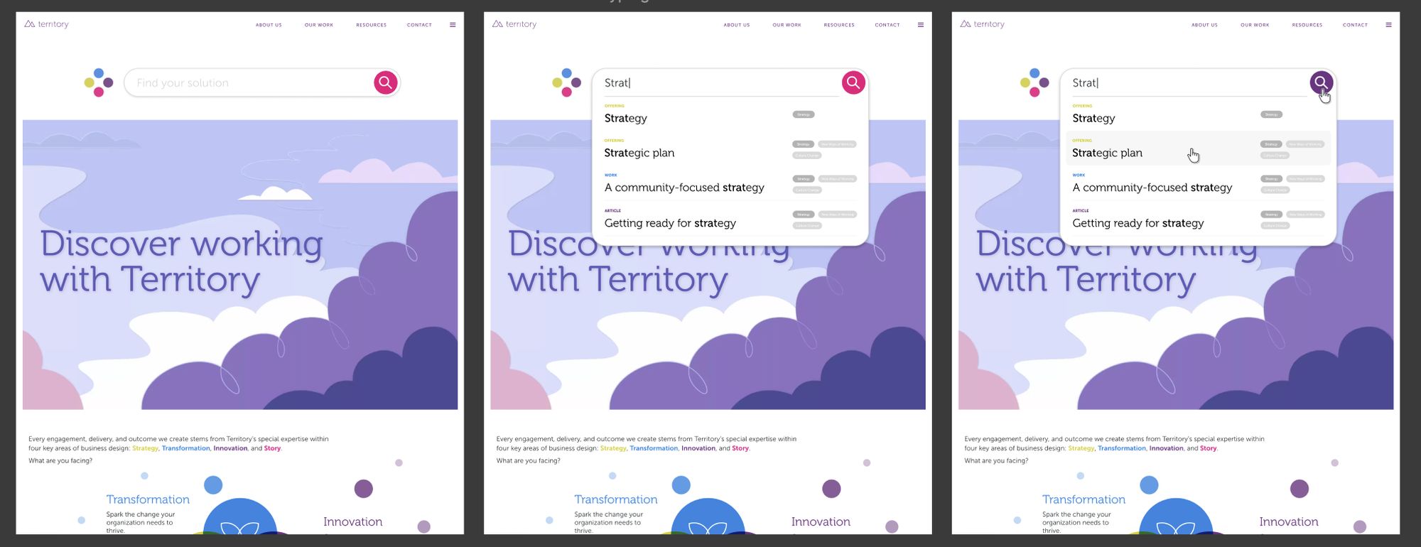
Search that returns a path
Three letters is enough to surface matching practices, work, and articles together. It turns an open-ended question about what you are facing into a short, specific set of places to start.
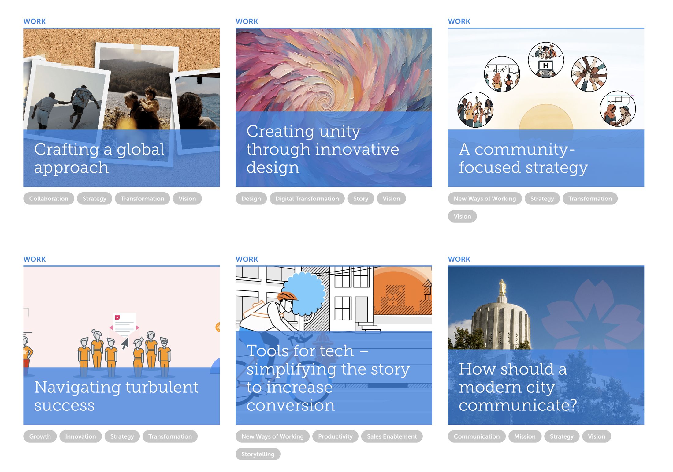
Work that looks the part
The case studies were the proof, and they read like documentation. Dense blocks of text, one template for every story, and almost nothing to show for projects whose whole value was how they looked.
I rebuilt them around imagery instead of copy, giving each story a layout shaped by the work inside it rather than a container it had to fit. The writing got shorter, the visuals got room, and the portfolio finally carried the weight the work had earned.
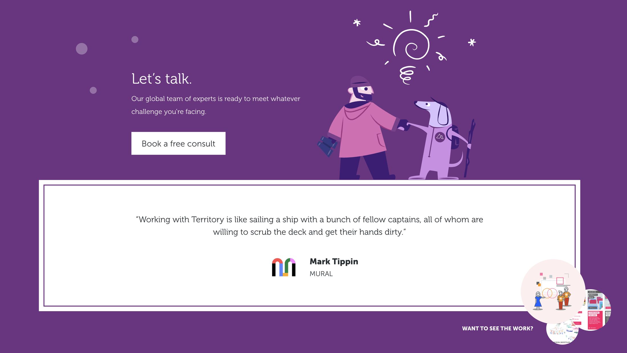
Every page ends the same way
Whichever practice a visitor lands in, the page finishes on one clear invitation and proof from someone who already took it.
One system. Four identities. No dead ends.
Four practices now share a visual language without losing what makes each one distinct, and every page offers somewhere to go next. The hover cards surface relevant work in place, and search turns a vague problem into a specific starting point in a few keystrokes.
Visit territory.co