A sales toolkit and icon system for FORTNA, a warehouse and distribution automation leader defending a market it used to hold on its own.
How do you defend a lead you used to hold by default?
FORTNA effectively created warehouse operations design as a discipline. Then growth slowed, competitors arrived, and the sales team started walking into rooms where their authority was no longer assumed before they spoke.
The toolkit had to stretch across very different client conversations while keeping every rep anchored to the same argument. Flexible enough to adapt, consistent enough that the story compounds across meetings.

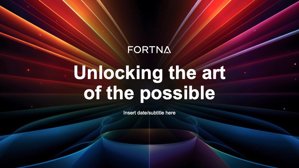
The opening slide, setting the tone before a single capability is claimed
Three acts, repeatable in any room
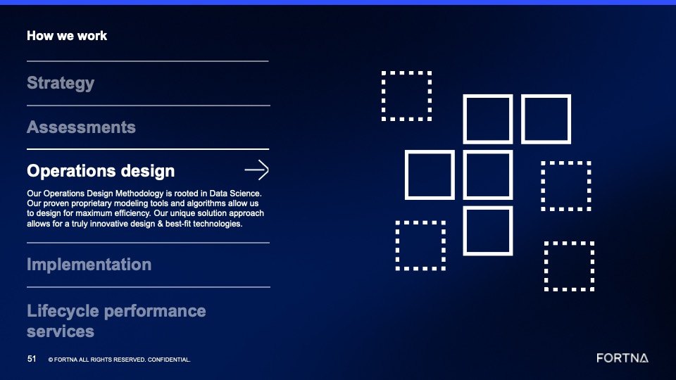
What FORTNA operations design actually is: the methodology, the modelling, and the proprietary tooling behind it.
Named-client results and testimonials, positioned as evidence rather than decoration.
The arc tying capability to outcome, and the part that has to survive after everyone leaves the room.

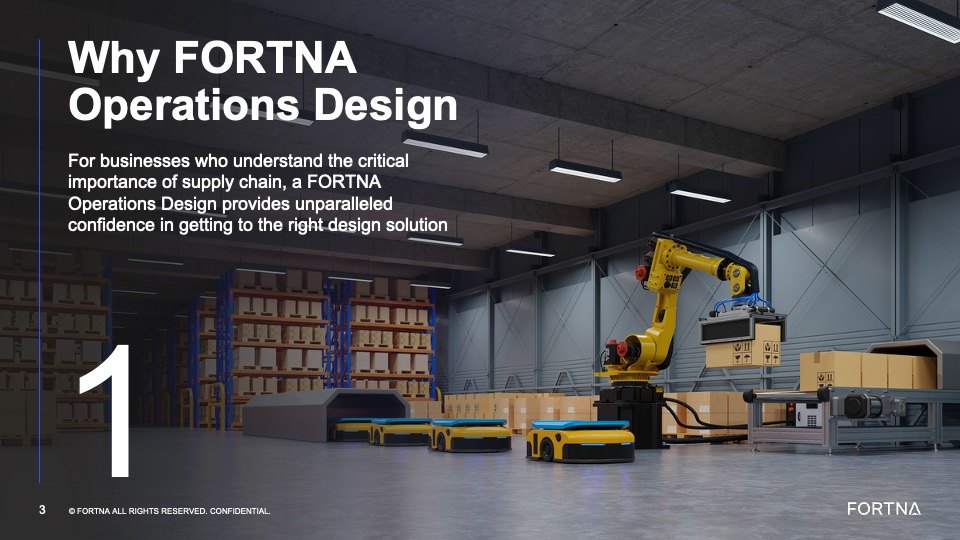
Chapter openers carry the argument rather than just numbering the deck

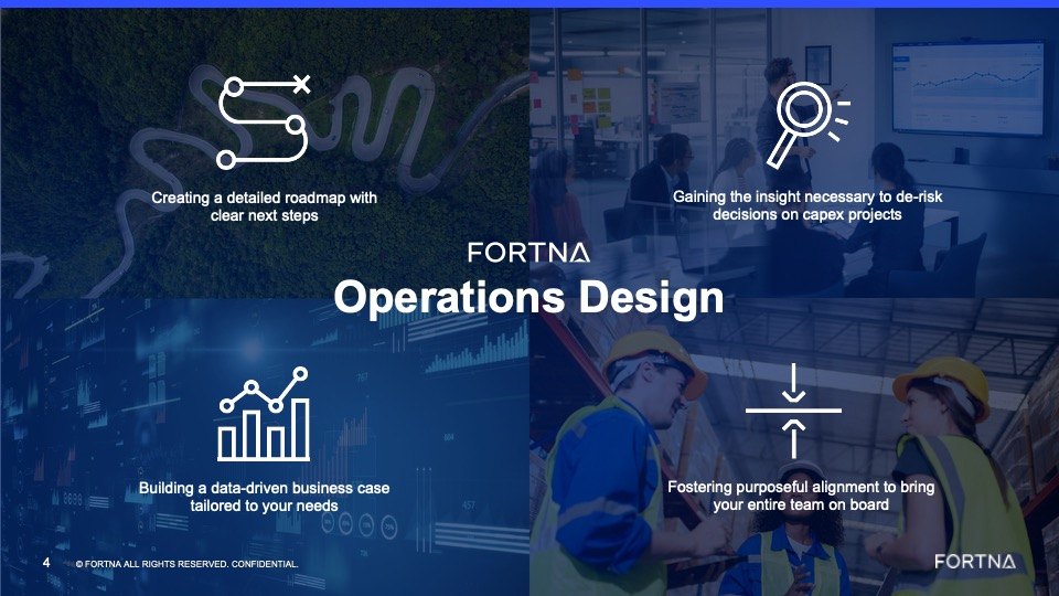
Four reasons to engage, given equal weight and equal space
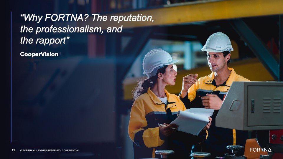
Client quotes were paired with the performance data sitting behind them rather than floated on their own. An O’Reilly Auto Parts executive on keeping pace with growth reads differently next to the chart that backs it up.
The design job was making evidence look like evidence. Restrained typography, real data, and none of the stock-photo optimism that makes buyers stop reading.

Alignment before artwork
Mapped strengths, weaknesses, mission, and audience from every angle, including the places where the internal story contradicted itself.
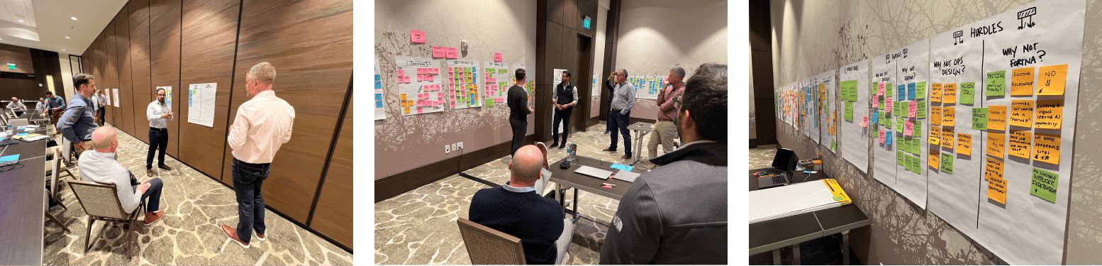
A working session with company leaders to find the assets worth building on, surface the proof behind them, and shape the larger story.
Turned those findings into the three-act toolkit, built for a high volume of prospect meetings rather than one showpiece pitch.
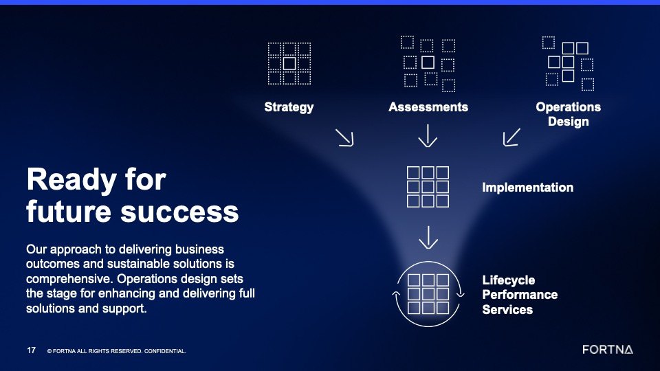
A modular set explaining the operations design process from strategy through lifecycle performance services.

Where the value story was pressure-tested before a single slide existed
The icons were built to explain one process inside one deck. Each stage got a modular mark that holds up as a full-bleed diagram and still reads at navigation size.
FORTNA has since taken the system company-wide and put it on their homepage, which is a better result than the deck itself.


Leadership and the sales team came out aligned behind a single clear value proposition, delivered as a toolkit flexible enough to survive a wide range of prospect conversations. The icon system went further than the brief and became part of how the company explains itself everywhere.
Read the case study