The challenge
Indoor golf is crowded. Almost none of it is built for golfers.
Most simulator rooms are a bar with screens, or a net with a launch monitor.
Neither one serves the player who actually wants to get better. That was the opening: a tour-level room for avid golfers in McKinney, built for practice and real rounds rather than a novelty night out.
Every piece of it started from a blank page. The name, the wordmark, the layout of the bays, the site, and the advertising that filled them.
Identity
A wordmark built like a scoreboard
Built to signal a serious room
Golf entertainment brands trade on brightness and noise. This one needed the opposite, because the people worth attracting are the ones already spending money on lessons and equipment, and they can tell the difference immediately.
The heavy geometric mark and the restraint of the palette both do that work. Deep green reads closer to a clubhouse than an arcade, and the coral gives it enough warmth that serious never tips into cold.

The space
Designed dark, on purpose
The screens are the brightest thing in the room
Most simulator rooms are lit like a garage. This one runs the other way, with deep green walls, low warm light, and coral wayfinding that reads instantly against it.
The result is a space that takes the round seriously without feeling like a club you cannot afford to join.


Practice, not novelty. The positioning every photograph had to earn.
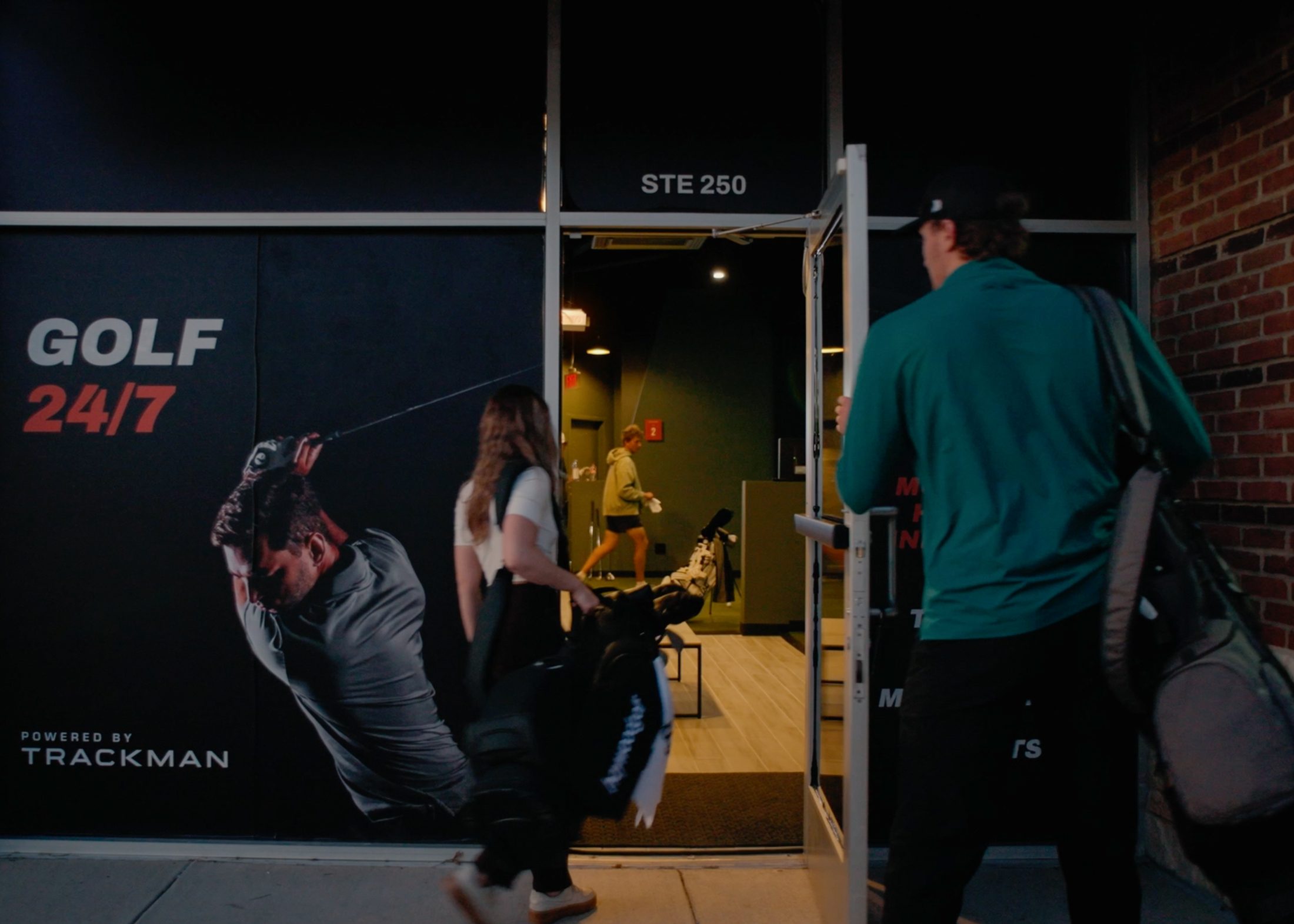
The first impression happens on the sidewalk
The studio sits in a suite that most people pass without reason to look twice, so the frontage had to work as advertising rather than a nameplate. Anyone walking by should understand what is inside and why it is worth stopping for, in the two seconds they give it.
It answers the questions a golfer already has before they reach the door, which turns foot traffic into walk-ins and gives every ad a physical anchor when people come to find us.
The website
The room, working while it is closed
Reserve a bay in under a minute
Most bookings happen late at night, on a phone, by someone deciding whether to play tomorrow. The flow is built for that moment rather than for a desktop browser.
Flexible options for every golfer
From memberships to public booking options, there are options for every golfer and group to come and play. The website had to surface and clarify these options.
Show the experience
Photography and video carry more weight than any description of the room. The site leads with what a round actually looks and feels like, so people arrive already knowing what they booked.
Paid media
One identity, three jobs
Launch
A dated giveaway that turned local awareness into a full room on opening night.
Acquisition
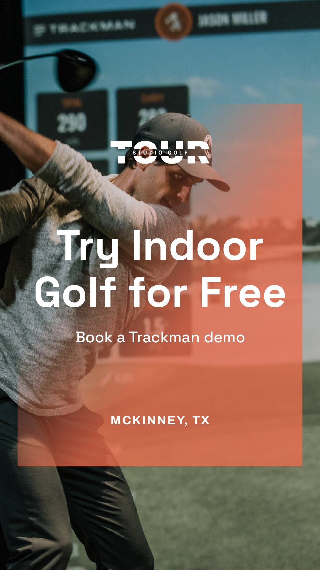
A free Trackman demo gave people a reason to come in without deciding anything first. Once a golfer is standing in the bay watching their own numbers, the room does the selling far better than an ad can.
Revenue
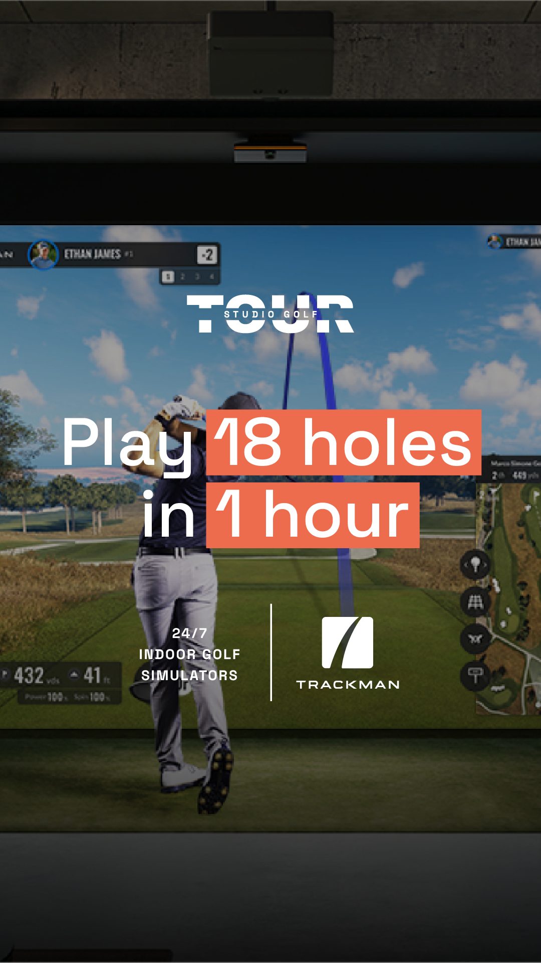
Ads built around the value proposition drive public bookings, while members provide consistent recurring revenue underneath them.

The numbers
What the brand actually did
Profitable
Three months from opening night to profit
Pre-launch list
Subscribers before the doors opened
Membership tiers
No long-term contract at any level
Member access
The promise the signage had to carry
The list proved the positioning before the buildout was paid off.
Five hundred people signed up before there was a room to book. The tier structure turned those first bookings into recurring revenue quickly enough to reach profit inside a quarter, which told me the brand, the pricing, and the go-to-market plan were one working bet rather than three separate guesses.
Visit the site